Amazon × Koto: What the Biggest Rebrand of 2025 Says About Brand at Scale
Amazon's first major rebrand in 20 years — 18 months, 50+ sub-brands, 15 markets. What Koto actually fixed wasn't a logo. It was the operational cost of brand fragmentation. And the lesson applies to any company growing fast enough to lose coherence.

Amazon has been the most visited website on the internet for most of the last two decades. Its logo — a wordmark with a curved arrow running from A to Z, doubling as a smile — was designed by Turner Duckworth in 1998. For 27 years, almost nothing changed.
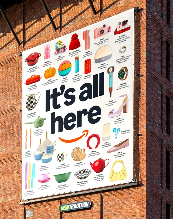
Then, in April 2025, Koto published a case study. The biggest rebrand of the year had been rolling out quietly for months — on delivery vans, on packaging, on Prime app interfaces, on Formula 1 race cars — before anyone officially announced it.
This is the story of what was broken, what Koto fixed, and what it tells you about the relationship between growth and brand coherence.
The problem had a name
Koto's brief for the project is unusually candid. "As Amazon scaled at extraordinary speed," the studio wrote, "the brand system sometimes struggled to deliver creative excellence at speed, fragmented across teams, regions, and experiences."
Fragmented is the key word. Amazon had been building products, services, and sub-brands at a pace that made design governance nearly impossible. Every new team spun up their own assets. Every new market localized in its own direction. Every new product line made its own typographic decisions.
The result: multiple shades of orange coexisting across the brand ecosystem. A typeface — Ember, originally designed for Kindle e-reader screens — being used for everything from packaging to global advertising, and quietly replaced with other fonts wherever it didn't work. Icons created independently across product and regional teams, producing what Koto called "a patchwork of styles and visual languages." Over 50 sub-brands, each with its own identity, many of them visually disconnected from the parent brand.

Koto founder James Greenfield described the situation directly: "Amazon is at times lots of different companies." The brand had become, in his words, "operationally hard to execute."
That's a brand problem. But it's also, more precisely, a growth problem wearing a brand costume.
What 18 months of work actually produced
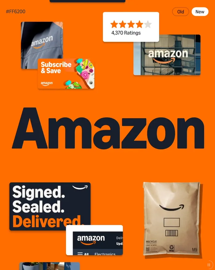
The visible part of the rebrand is relatively modest. The smile in the Amazon logo — previously more arrow than smile — has been redrawn to be deeper, warmer, and more explicitly expressive. The letterforms of the wordmark have been corrected for typographic consistency. A new Smile Orange replaces the scattered oranges that had accumulated across the system. Prime gets a more saturated, digital-first blue. Amazon Grocery gets a vibrant green.
These are not dramatic changes. They are not supposed to be.
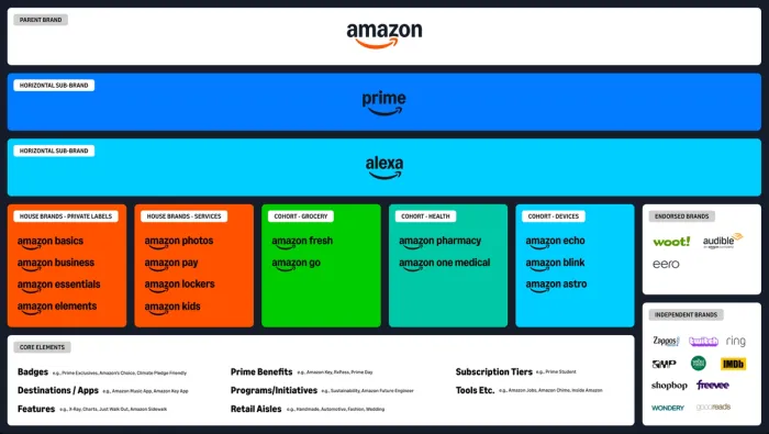
The real work is invisible in a single logo: it lives in the architecture. Koto designed a custom alphabet called Amazon Logo Sans to unify every sub-brand under a common typographic system. They evolved Ember into Ember Modern — working with Berlin type foundry NaN to make the typeface functional in 364 languages, from Arabic to Korean to Thai. They built a new icon system derived from the smile and Ember Modern, replacing the patchwork with a single, standardised toolkit.
Most importantly, they reorganised the 50-plus sub-brands into cohorts — groups of like-minded brands that share a visual approach while remaining connected to the master brand. Entertainment brands can be bold and expressive. Healthcare brands can be calm and reassuring. Grocery can be vibrant and food-forward. Each cohort has its own palette and personality, but all of them are legibly Amazon.
This is what brand architecture looks like when it actually works: not uniformity, but coherence. The same underlying logic, expressed differently depending on context.
The results
In the first six months after launch, Amazon reported record levels of Prime membership growth, increased cross-category engagement, and its strongest brand sentiment scores to date. These numbers are hard to attribute cleanly to a rebrand — Amazon is a company with thousands of variables — but the direction is clear.
Koto summarised the outcome on their case study page: "The rebrand gave Amazon back its center. What was once fragmented is now unified, so teams move faster, and customers feel the same confidence, whether streaming, shopping, or filling prescriptions."
Teams move faster. That sentence is doing a lot of work. It's not about aesthetics. It's about the operational cost of brand fragmentation. When every team has to make its own design decisions from scratch — because there is no shared system, or the shared system doesn't fit — you lose speed, consistency, and eventually trust. A unified system is not just prettier. It's cheaper to run.
What this means if you're building a company
The Amazon situation is extreme in scale but completely ordinary in its root cause. Every company that grows fast enough, and diverse enough, ends up here. New products, new markets, new people — each making locally reasonable decisions that add up globally to incoherence.
The moment you notice it, it usually looks like this: your website and your app feel like they're from different companies. Your pitch deck doesn't match your social media. Your marketing team and your product team use different fonts. Your sub-brands have been named by whoever launched them, not by a system.
At startup scale, this is normal and survivable. At growth scale, it becomes a tax. Every customer touchpoint that feels inconsistent costs you a small amount of trust. Every designer who has to rebuild a component from scratch costs you time. Every campaign that goes off-brand costs you coherence. These costs are individually invisible. Collectively, they're enormous.
What Koto did for Amazon was build the infrastructure to stop that accumulation. Not by controlling everything from the top — that doesn't work at Amazon's speed — but by creating a system flexible enough to move at that speed without fragmenting.
The smile stayed. Everything else was rebuilt around it.
That's the principle worth keeping: anchor on what you own, build systems around it, and let the system do the governance work that no single team can do alone.
Your brand might already be fragmenting — you just haven’t named it yet.
Let’s talk