Decathlon Orbit: When France's Most-Loved Sports Store Decided to Become a Brand
For 48 years, Decathlon didn't need a symbol. The blue was enough. In March 2024, everything changed — and the story of L'Orbite contains lessons that apply to any founder wondering whether their business has a brand problem.

For 48 years, Decathlon was the kind of company that didn't need a symbol. The blue was enough. Everyone knew it — not as a brand identity, but as a building. A big blue box by the highway, stocked with everything you needed for every sport you'd ever try. Cheap, reliable, French.
On March 12, 2024, that changed. Decathlon unveiled its first-ever brand icon: L'Orbite. A new blue. A bespoke typeface. A slogan in English. And a portfolio slashed from over 80 sub-brands down to 13.
This is not a logo refresh. It's a structural decision about what kind of company Decathlon wants to be — and it contains lessons that apply to any founder wondering whether their business has a brand problem.
The brief that explains everything
The agency behind the rebrand was Wolff Olins, one of the most rigorous brand consultancies in the world. Their diagnosis of Decathlon, published at launch, is the most important sentence in this story:
Decathlon has always been "a sportsmaker, misunderstood as a retailer."
That's the whole brief in nine words. Decathlon designs and manufactures most of what it sells. It holds 900 patents. It employs 2,800 product designers. By any definition, it's a product company — the same category as Nike or Adidas. But visually and commercially, it had positioned itself as a distributor: big stores, blue buildings, price-first communication.
The gap between what Decathlon actually is and how it was perceived had become a business problem. Not because the stores weren't working — revenue kept growing — but because that identity was hitting a ceiling. It made international expansion harder. It made the brand invisible in digital contexts where the blue building doesn't exist. And it made it impossible to charge for what the products were actually worth.
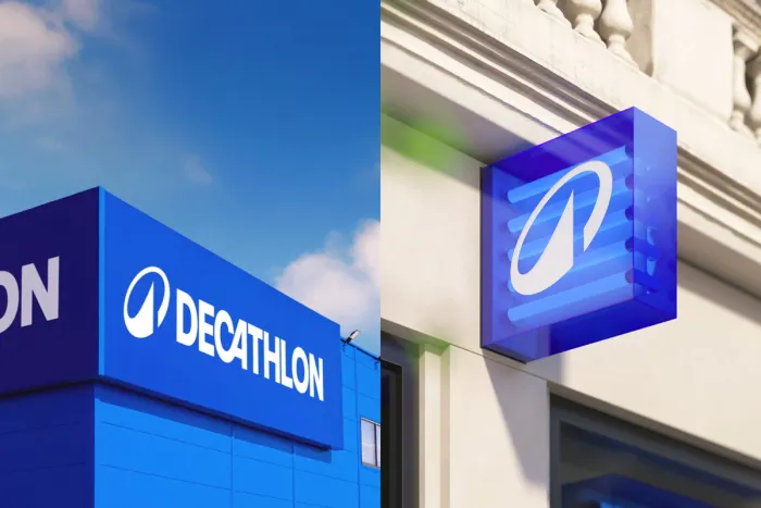
What the Orbit actually does
The new symbol is designed around Decathlon's existing typographic DNA — the iconic leaning A in the wordmark, the curve of the C. It reads as a mountain, a wave, a sail, a heartbeat. It's deliberately open-ended: one shape that can carry meaning across 80 sports and 70 countries without ever needing translation.
That ambiguity is intentional. Nike's swoosh doesn't mean anything specific either. What it means is Nike. The symbol is the beginning of that journey for Decathlon — creating a mark that can stand alone, that can anchor a product without a building behind it, that works at 16px on a favicon and at 2 meters on a stadium banner.
Alongside the Orbit: a bespoke typeface called Decathlon Sans, designed for what Wolff Olins called an "expressive yet technical feel." The blue was deepened and made more dynamic. And the 80-plus sub-brands — Artengo, Wedze, Kipsta, Domyos and dozens more — were collapsed into 13 focused sport categories, each anchored to the master brand.
This last decision is the most underrated part of the whole rebrand. Decathlon had built those sub-brands over decades, each with its own visual identity, its own customer recognition. Cutting from 80 to 13 is not a design choice. It's a statement that says: we are the brand. Everything else is just context.
The lesson for any founder building a business
There's a moment in the growth of most companies when the identity they built to launch becomes the ceiling that stops them scaling.
Decathlon hit that moment with a clarity most companies never achieve. Their CEO Barbara Martin Coppola said it openly at the launch event: "Decathlon is known for decades for its big blue stores. Now we're opening that blue box to the rest of the world."
The blue box had worked. But a box, by definition, has walls.
The transition from distributor to brand is not primarily about changing a logo. It's about making a decision on what the company is willing to be known for beyond its product catalogue and its real estate. Nike doesn't sell shoes — it sells what it means to push yourself. Decathlon's bet with the Orbit is that it can own something similar: the idea that sport belongs to everyone, at every level, in every country, regardless of budget.
That's the brand. The logo is just where it starts.
What the numbers say so far
The rebrand launched in March 2024. Decathlon reported 5% global growth for the year, consolidated expansion into new markets, and began a progressive rollout across its 1,700 stores expected to take three years. The Orbit appeared on the jerseys of the Decathlon-AG2R La Mondiale cycling team — one of the cleanest signals of intent: this is a brand that wants to be seen at the highest level of sport, not just in the parking lot.
The full verdict will take time. Deploying a new identity across 70 countries and 100,000 employees is not a campaign — it's a decade-long construction. But the strategic logic is sound. And the brief was honest about what the problem actually was.
That honesty — naming the gap between what you are and how you're perceived — is the hardest part of any rebrand. Most companies get consultants to validate what they already believe. Decathlon got Wolff Olins to tell them they'd been misunderstood for 48 years.
Then they built a symbol to fix it.
Your brand might be the ceiling stopping you from scaling.
Let's figure it out