The Amazon River Designed Its Own Logo — And It’s the Most Radical Brief of the Decade
FutureBrand São Paulo didn’t design the Amazonia brand identity. The river did. How satellite imagery of 25,000 km of waterways became a complete alphabet — and what this radical brief says about where brand identities should actually come from.

When FutureBrand São Paulo took on the brief for Amazonia’s first unified brand identity, they did something most agencies would never dare propose to a client: they handed the design brief to the territory itself.
The result, launched in April 2026, is one of the most talked-about identities of the year — and a legitimate challenge to how we think about where a brand comes from.
A brief the river wrote
The Brazilian Legal Amazon covers roughly 60% of Brazil. Nine states. 28 million people. 25,000 kilometers of navigable waterways. And until now, no unified visual identity.
The initiative came from RAI — Integrated Amazon Routes — and Embratur, the Brazilian tourism authority. Their goal was to build something that could serve as a common platform for the entire region: tourism, economic development, local products, international visibility.
FutureBrand São Paulo took the project and made a choice that changed everything: instead of designing a logo, they decided to find one.
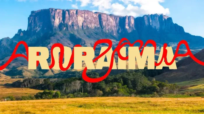
Using real satellite coordinates from the Amazon River and its tributaries, the team analyzed aerial imagery of the waterways as they wind through each of the nine states. In the curves, bends, and bifurcations of those rivers — in the actual geography of the place — they identified letterforms. Not approximations, not loose inspiration. Real letterforms, pulled from real satellite data, and translated into a complete alphabet called Igaratipo.
The typeface was made by humans. But it was shaped by rivers.
What this inverts
Most brand identities follow the same logic: a designer creates a mark, a color system, a typeface — and then applies it to the territory or product or company. The identity is imposed on the subject.
Amazonia does the opposite. The territory is the source of the identity. The brief wasn’t “design something that represents the Amazon.” It was “find what the Amazon has already designed.”
This inversion is not just poetic — it has structural consequences for what the brand is and how it behaves.
A conventional logo is a fixed artifact. A mark you can pin to a PDF and send to a printer. Amazonia’s system is by definition living, because the source material — the waterways — exists in constant movement and variation. The identity adapts across the nine states, shifting in color, texture, and illustration to reflect the specific cultures, flora, and fauna of each region, while remaining recognizable as a single system. Not a logo. A language.
The craft behind the concept
What makes this project more than a good idea is the execution.
FutureBrand did not work alone. They embedded themselves with people from the region — illustrators Cristo, Winy Tapajós, Malu Menezes, and Beatriz Belo; photographers Ori Junior and Bob Menezes; letterer Odir Abreu; and Instituto Letras que Flutuam, an association dedicated to preserving the decorative lettering traditions of Amazonia.
The result is a brand that carries cultural authority, not just visual novelty. Every element traces back to the territory and the people who live in it. That traceability is not incidental — it is the entire argument of the brand.
Arnaldo de Andrade Bastos, partner and CDO at FutureBrand São Paulo, put it directly: the Amazon has always had the potential for a strong destination brand. What was missing was the structure to bring all the stakeholders together and build it.
That structure now exists — anchored in a typeface that the river wrote.
What it means for destination branding
Territory branding is one of the hardest briefs in the industry. The client is not a product, not a company, not a single decision-maker. The client is a place — often politically complex, culturally heterogeneous, and carrying the weight of how the rest of the world already perceives it.
Most destination branding responds to this by going abstract. A simple mark, a color, a tagline. Something legible and inoffensive that doesn’t claim too much.
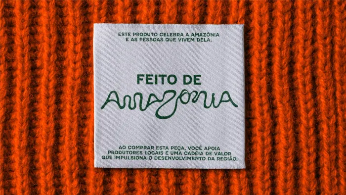
Amazonia refuses that approach. It claims everything — the geography, the typography, the illustration style, the product certification seal (Feito de Amazônia, “Made of Amazon”) — and builds a system strong enough to carry that weight.
The ambition is not just tourism. Bruno Reis, international marketing director at Embratur, was explicit: this brand is a strategic tool for sustainable development, for positioning the Amazon at the center of the global bioeconomy, for strengthening the micro and small entrepreneurs of the region. The visual identity is the infrastructure for an economic argument.
That’s a different category of brief than most agencies ever work with.
What you should take from this
You are not branding the Amazon. But the principle behind Igaratipo applies at any scale.
The best brand identities don’t represent their subject — they emerge from it. They ask: what is already true about this company, this product, this place? What would we find if we looked closely enough at the source material instead of reaching for references?
Most brand projects start with a moodboard. FutureBrand started with satellite imagery. The instinct is the same — find the truth of the thing — but the level of commitment to that instinct is what separates a good identity from an extraordinary one.
The practical question for any brand you’re building or reviewing right now: how much of your visual identity actually comes from the thing itself? And how much of it was imposed from outside — borrowed from a trend, copied from a competitor, generated from a brief that started with “something that feels modern and trustworthy”?
Amazonia is a useful mirror. Not because you should build your brand from satellite data. But because FutureBrand’s bet — that the most powerful visual language for a place is the one the place has already written — is a bet worth understanding.
The river has always been there. Nobody had looked at it as a typeface before.
Your brand identity should emerge from your business — not be imposed on it.
See my branding work