Imperfection as a Brand Strategy in the AI Era
AI generates flawless visuals in seconds. That's exactly why imperfection is now your most valuable brand asset. In 2026, the marks that build trust are the ones that look unmistakably human.

When perfection becomes noise
Think about the last ten brand visuals you saw on Instagram. Chances are they all looked like they were generated by the same tool — because they probably were. Perfect gradients. Impeccable typography. Technically flawless compositions that somehow feel completely hollow.
This is what happens when AI handles aesthetics at scale. Perfection stops being impressive and starts being invisible.
We are now past the point where a polished logo or a sleek landing page signals quality. AI can generate either in seconds. What it cannot generate — not convincingly, not yet — is the kind of visual texture that comes from a human hand, a deliberate mistake, or a line that is just slightly off.
That texture is now worth more than polish.
The numbers behind the shift
This is not a niche designer opinion. It is a documented market movement.
According to Adobe's 2026 design data, 73% of designers are now deliberately incorporating imperfect elements to differentiate their work from AI-generated content. Canva's 2026 Design Trends Report, built from analysis of over 260 million users, declared 2026 the year of "Imperfect by Design." Searches for DIY and collage-inspired elements on their platform surged 90% year over year.
On the consumer side, the data is just as clear. Research from SmythOS found that 52% of consumers reduce their engagement with content they believe is AI-generated. That is not a preference gap. That is a trust problem becoming a revenue problem.
When something looks too smooth, audiences disengage — even when they cannot articulate why. Their brain flags it. The result is what researchers now call the "AI suspicion penalty": lower click-through rates, shorter time on page, weaker conversion.
The brands building trust in 2026 have understood this. They are not cutting corners. They are strategically choosing where to introduce human marks — and it is working.
Case in point: two very different bets
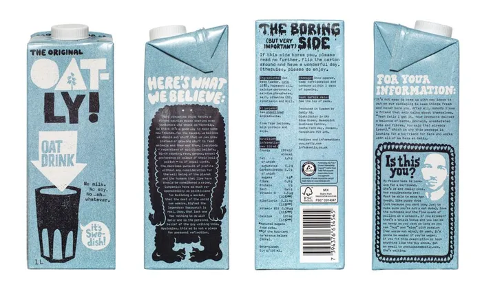
Oatly is the textbook example. A Swedish oat milk brand with a media budget that was 2% of its giant dairy competitors. Rather than chasing professional polish, they did the opposite. Hand-drawn wobbly type. Conversational copy that reads like someone just wrote it with a marker. Illustrations that look like doodles on the side of a notebook. The packaging became their main media channel — and the brand grew 12 times in a few years, eventually going public.
The logic was not accidental. Their creative team made a calculated decision: in a category dominated by sterile food industry aesthetics, looking handmade would make them look honest. It did.
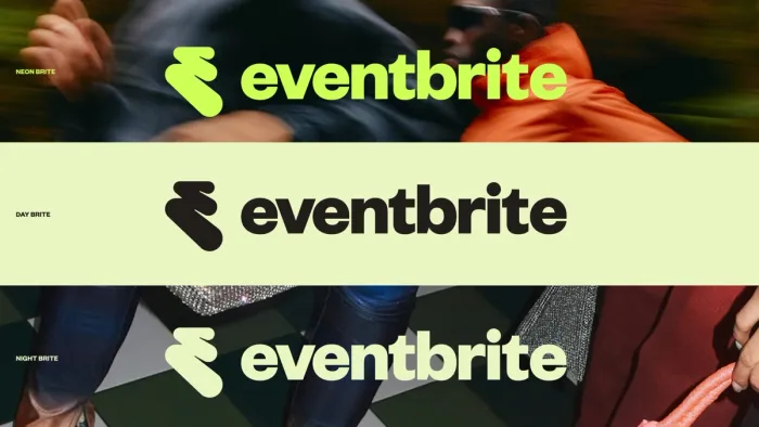
Then there is Eventbrite. A global events platform with a very different profile — not a food startup, not a scrappy indie brand. In March 2025, after a period of declining revenue, they partnered with design studio BUCK to completely rethink their identity. Out went the classic lowercase "e" in a circle. In came "The Path" — a new monogram built from thick, paint-like brushstrokes. The kind of mark that looks like someone drew it with real weight and intention, not generated from a template. Bold, expressive, unmistakably hand-touched.
Different industries, different scales, same strategic move. The imperfection was the point.
This is not about looking cheap
There is an important distinction here that gets lost in the trend coverage.
Naive design — the term designers use for this aesthetic of intentional imperfection — is not the same as low effort. Oatly's packaging is precisely crafted. Every wobbly letter is considered. Every odd illustration is placed deliberately. Rousseau, the 19th century painter who inspired the movement's name, was meticulous in his imprecision.
The Kittl 2026 Design Trend Report captures it well: raw imperfection is now sitting beside AI-assisted precision as designers reclaim emotion and humanity in their work. The goal is not to look unfinished. It is to look human. These are very different targets.
The distinction matters especially for clients in credibility-sensitive sectors. A fintech company does not need wobbly type — but they might benefit from a slightly irregular serif that feels crafted rather than generated, or a texture in their brand materials that reads as tactile rather than digital. The level of imperfection should match what your audience expects, not copy what works for a food brand or a creative studio.
So, what does this mean for your brand?
If your current identity could have been generated by an AI tool in three seconds, it probably needs more personality.
Not more decoration. More character. There is a difference.
Character shows up in a custom letterform that has a slightly unexpected proportion. In an illustration style that belongs uniquely to you. In a tone of voice that sounds like a person — opinionated, specific, occasionally odd — rather than a brand trying to appeal to everyone.
The brands winning client trust right now are not the ones with the most technically perfect logos. They are the ones that feel real. The ones where you can sense that a person made a decision — not an algorithm made a prediction.
In a world where your competitors can generate a polished brand in an afternoon, the most powerful thing you can invest in is something that looks and feels unmistakably made.
That is what great brand design does in 2026. Not flawless. Human.
Your brand might be too polished for its own good.
Let's talk about your identity