The OM rebrand: what 22 years of logo inertia says about brand courage
Marseille just unveiled its 12th crest in 127 years. Supporters
On April 8, 2026, Olympique de Marseille unveiled its new crest during a gala dinner at Fort Ganteaume. The reaction from supporters was immediate, predictable, and entirely human: split.
Some loved it. Many didn't. A few went straight to Twitter to say the club had betrayed everything.
Welcome to the most brutal brief in branding.
A logo is never just a logo
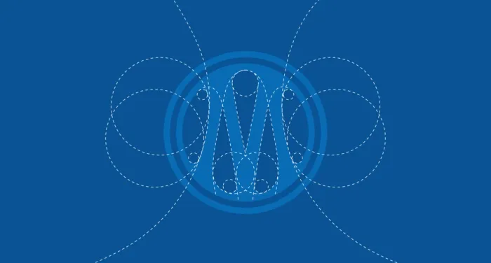
Let me be direct: the OM rebrand is technically well-executed. It's rounder, more compact, built for digital. The new design draws explicitly from the club's own history — the white ring references the 1973 crest, the M's structure echoes the original 1899 monogram, and the double circle nods to the iconic 1993 version, the year Marseille became the first French club to win the European Cup. Le Méridional
That's not a coincidence. That's a considered design strategy: using the past as a foundation rather than a target.
But here's the thing. In Marseille, an écusson is more than a visual asset. It's a shared language — a symbol that transcends social, generational, and cultural differences in one of France's most diverse cities. Seestudio You can't optimize that with a design brief.
This is the paradox at the core of every major rebrand: the moment a symbol becomes meaningful enough to matter, it becomes almost impossible to change.
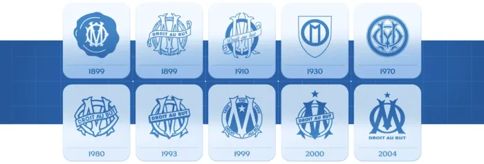
127 years, 12 crests — and one constant
Before we talk about the new logo, let's talk about what it's built on.
When René Dufaure de Montmirail founded the club in 1899, the first crest was already there: the O and M intertwined, with the motto "Droit au but." Le Méridional That phrase — Straight to the goal — wasn't invented by a marketing team. It was the personal motto of Montmirail's future wife, Marguerite Dubois, whose determined character inspired the club's identity from day one. Grapheine
It has appeared on almost every version of the crest since.
In 1935, the club modernized with an Art Deco-influenced design — more geometric, more structured — that stayed in place until 1972. Then, in the Tapie era, the star was added above the badge in 1993 to mark the Champions League win, the first ever by a French club. Le Méridional The golden color appeared in 1999 to celebrate the club's centenary — a deliberate signal of prestige and legacy. Olympique de Marseille
The 2004 redesign — by local Marseille agency Encore Nous — merged the O and M into a unified Pantone blue, repositioning both letters at the same visual height, and added a gold star and the "Droit au but" motto in linear letters below. Grapheine That logo lasted 22 years. It survived the Tapie aftermath, the McCourt era, the Europa League final of 2018, and half a dozen coaching changes.
Twenty-two years is a long time in football. It's also a long time in branding.
Why now?
The timing wasn't random. It never is.
Club president Alban Juster was candid about the business logic: "We have less and less TV rights revenue. Today, one of our most important assets is our brand." Foot Mercato
That sentence should land for every founder reading this. A time comes when your product or service alone doesn't carry the weight of the business. The brand has to do work on its own — on social, on merchandise, on global reach. And that means the visual identity needs to perform in contexts that didn't exist 20 years ago.
The DG of the club, Alessandro Antonello, put it plainly: "When the previous logo was designed, there were no smartphones. We weren't in a digital world. Today everything is digital. With this logo, we're ready for the challenges ahead." France Bleu
This is the real driver behind most modern rebrands — not aesthetics. Scalability. A logo that works as a 16px favicon, a stadium banner, a TikTok avatar, and an embroidered patch on a kit. Those are four fundamentally different constraints. Most logos designed before 2010 weren't built for all of them simultaneously.
The backlash is the product
Here's something designers know that clients often don't: when you rebrand something people genuinely love, backlash is not a failure signal. It's a proof of relevance.
When Leeds United unveiled their 2018 crest, over 77,000 fans signed a petition to scrap it. The club reversed the decision within weeks. GiveMeSport That's not a story about a bad logo. That's a story about a club that didn't understand what it was changing, or why.
The OM situation is different. The new logo doesn't position itself as a rupture — it explicitly frames itself as a synthesis of the club's entire graphic history. Le Méridional That's a defensible position. Whether supporters accept it emotionally is another matter entirely.
As Transform Magazine put it in a 2025 piece on football rebrands: "The fear of backlash can lead to watered-down solutions that try to say too many things and end up saying nothing at all." Transform magazine The OM identity team clearly tried to avoid that trap. The result is bold enough to polarize, but grounded enough to justify.
Compare this to Juventus in 2017, who replaced a historic badge with a minimal "J" — explicitly designed to reposition the club in the wider entertainment and lifestyle industry, far beyond football. Holdens That rebrand still divides opinion today. But Juventus held firm. And commercially, it worked.
The lesson isn't "always keep the old logo." The lesson is: know what you're changing, and why, and be prepared to explain it without apologizing.
The one detail that reveals everything
Of all the decisions in this rebrand, one is the most revealing: the star.
The star — added in 1993 to mark the Champions League win — and the motto "Droit au but" are not present on the primary logo mark. The president explained: "Removing them from the logo gives it more legibility. They'll still appear on the match kits and training gear." Foot Mercato
This is a sophisticated branding move. It separates the institutional identity from the sporting identity — giving the club a flexible mark that can live in non-sporting contexts (partnerships, cultural events, digital products) without the weight of the full badge every time.
It's also the decision most likely to generate long-term resentment if the club doesn't win.
Because that's how brand perception works. The logo isn't the problem — the results are. If OM lifts a trophy next season wearing that crest, supporters will come around fast. If they don't, the badge becomes the scapegoat.
That's not a design problem. That's a sports problem.
What this means if you're not a football club
You don't run a 127-year-old institution with 100,000 passionate supporters. But you might be running a company that's been using the same visual identity for 10 years. Or 5. Or 15.
The OM rebrand is a useful mirror.
It asks: how much of your attachment to your current logo is rational, and how much is inertia? Are you keeping it because it works, or because changing it feels like too much effort and too much risk?
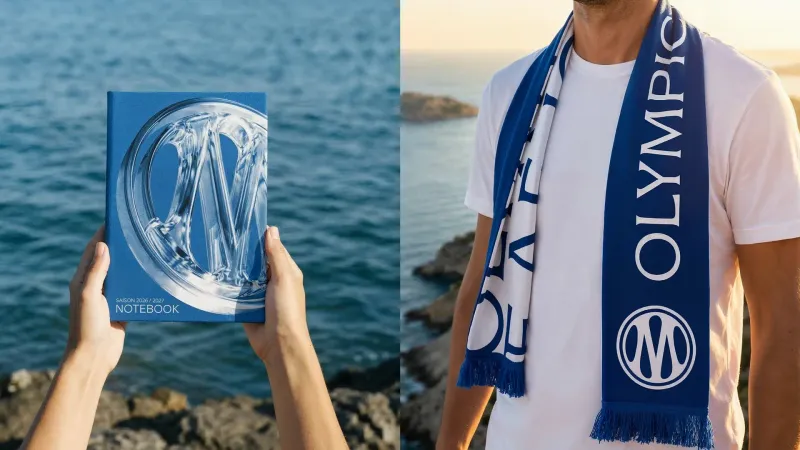
The OM took 24 months and built a system — a new blue, a custom typeface called OM Marseille, a dual-use badge system (institutional vs. sporting). They analyzed every historical shade of blue the club had ever used — from the Mediterranean to the Marseille street signs — to build a new reference color called "Bleu Marseille." OM That's not a logo refresh. That's a brand architecture project.
Most companies don't need that level of rigor. But they do need to ask the same questions: what does our current identity communicate, who is it communicating to, and is that still true?
A logo that made sense in 2010 might be actively working against you in 2026. Not because it's ugly. Because the world moved, and it didn't.
The verdict
The new OM logo is not the disaster supporters are claiming. It's also not the revelation the club's comms team is presenting it as.
It's a careful, well-researched identity update that will age better than the immediate reaction suggests — provided the club builds around it consistently and, ideally, wins something.
The real question was never "is this a good logo?" The real question was always: "is the organization behind it ready to make this mean something?"
That part, no designer can answer for them.
Your brand is also carrying 20 years of history. Is it still working for you?
Let's talk about your identity